Bross in Toronto for the Victor Restaurant

Following an important restyling, the Victor Restaurant re-opens at the Le Germain Hotel Toronto Mercer. A flexible place with different functional areas, marked by a redesigned retro aesthetic, curated by the international studio DesignAgency. To furnish it, the Break collection of chairs, armchairs and stools by Bross.
In 2003 Le Germain Hotel Toronto Mercer made his debut in the Canadian Capital city, which, close to the old town has offered since its grand opening one of the most apreciated destinations of the metropolis.
Wooden wainscoting and an international and sofisticated language, a great lobby and multilevel terraces had always defined some of the main characteristics of the building, as well as a wide restaurant on the ground floor, that twenty years from the opening has undergone an important restyling.
The appearance has been curated by DesignAgency – headquartered in Toronto, Los Angeles, Barcellona and Washington – which transformed the Victor Restaurant in a flexible space, closely connected to the city. The access, in fact, is no longer exclusively from the hall, but may take place directly from Mercer Street, in order to allow its best use not only by the hotel’s clients but also by the external public.
The entrance from the street overlaps a spot dedicated to takeaway coffees, which anticipates the different reference areas – breakfast, lunch, dinner, cocktail bar – based on which the restaurant’s interior has been conceived, with a large open space articulated by functional islands. DesignAgency conceived these latter as multi-purpose furniture: on the one hand they are white lacquered wood structures, arranged with countertops enriched by glasses, ceramics and ornaments; on the other, they are upholstered benches covered in oil blue leather, flanked by tables of different size and shape, with shiny white top, profile in brushed brass with a black structure. The tables are then accompanied by the chairs and armchairs of the Break collection by Bross, designed by Enzo Berti, which echoes the upholstered decorative motif present on the benches: on the front of the shell it has a quilted effect, with thin vertical seams, while the cover has been selected in black colored leather for the armchairs and grey colored for the chairs, with a tone on tone laquered wood structure.
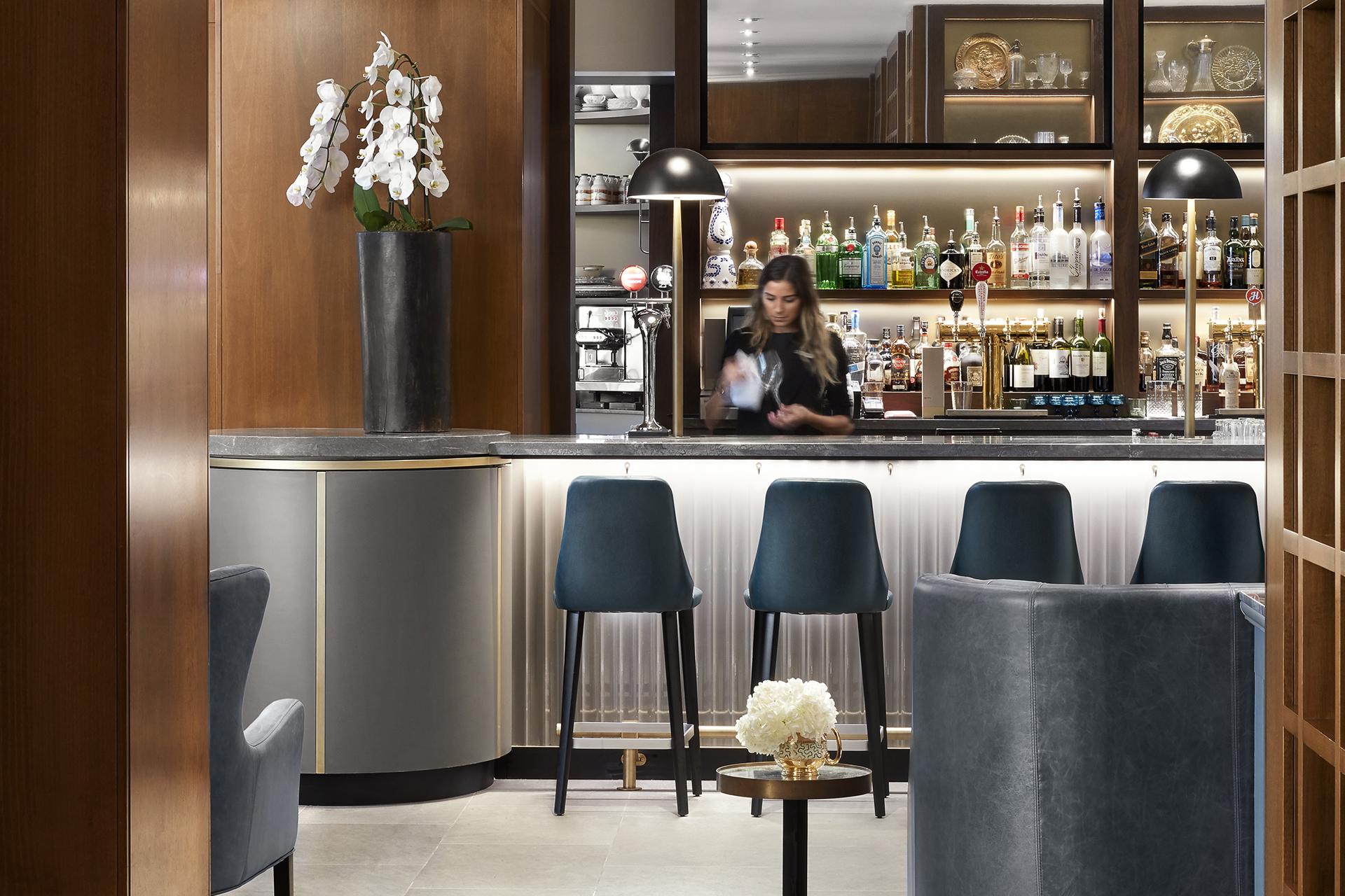
In the area dedicated to cocktails, Break can be found in the stool version with the same characteristics of the chair: the gunmetal color of the leather cover matches the large counter with a fluid form, with top in grey natural stone and brass details.
The rear wainscotings are made of a warm wood, with display cabinets creating a geometric grid where ceramics, dishes, glasses, handcrafted vases and small pictures are placed, that make the environment warm and experienced.
For the restaurant’s floor, DesignAgency has mixed different materials: large dark oak staves come together with grey ceramic surfaces, while small tiles with black and white floral patterns define some parts in a more decorative language.
The ceiling features a sculptural play of slender tubular brass elements with spherical light diffusers in frosted glass, which accentuate the retro-inspired look of the place, further enriched by swaying curtains around the room’s perimeter.
